

Empty cart
No products in the cart.
Return to Shop
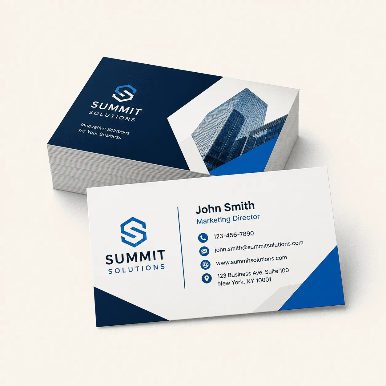
By Mahyar Haghighi, owner • Super Printers, Laguna Hills, CA • Published August 2026
A business card is often the smallest piece of marketing a company owns — and one of the most handled. It gets passed across a table, tucked into a wallet, pinned to a corkboard. That physical staying power is exactly why the design choices on a small business card matter more than their size suggests.
If you are a small business owner or solo professional trying to figure out what actually makes a card worth keeping, here are practical ideas we have seen work — and a few that tend to backfire.
Start With What the Card Needs to Do
Before picking a finish or a color, decide the card’s job. A card handed out at a networking event needs to be scannable at a glance — name, role, one way to reach you. A card left with a completed job (a repair, a delivery, a consultation) can carry more: a QR code to book again, a referral incentive, a short list of services. Designing the card around its actual use case beats designing it to look impressive and hoping it works everywhere.
Business Card Ideas That Hold Up
1. One Accent Color, Used Consistently
Cards that use a single accent color — on the logo, a divider line, or contact icons — read as more deliberate and professional than cards trying to work in every brand color at once. If your other materials already use a specific color, whether that’s your website, storefront signage, or invoices, repeating that same color on your business card reinforces brand recognition every time someone looks at it. Consistency across touchpoints is worth more than novelty on any single piece — a card that matches your existing visual identity does more for brand recall than one that introduces a completely new color scheme just because it looks nice on its own.
2. Matte or Soft-Touch Over High-Gloss for Most Businesses
Gloss finishes photograph well and can look striking under studio lighting, but they show fingerprints and scuff marks quickly, which isn’t ideal for a card meant to survive a wallet, pocket, or desk drawer for weeks or months. Matte and soft-touch laminates hold up better to regular handling and read as more premium to the touch, which matters since touch is the one sense a digital business card or a saved phone contact simply cannot replicate. For most small businesses — especially service providers who hand cards out in person — that tactile impression during the handoff often matters more than how the card looks in a product photo.
3. Round or Square Corners as a Deliberate Choice, Not a Gimmick
Rounded corners resist the dog-eared, curling look that square corners develop after a few weeks of pocket or wallet wear, which is a small but real durability upgrade rather than just a stylistic flourish. It’s worth considering specifically if your cards tend to get carried around rather than filed away immediately after an event or meeting — a contractor’s card in a customer’s glovebox, for example, takes a lot more physical wear than one that goes straight into a desk organizer. Square corners still work fine for cards that are more likely to be filed quickly, so the right choice really depends on how your customers are likely to handle and store the card.
4. Back-of-Card Real Estate
The back of a business card is free space that most businesses simply leave blank, which is a missed opportunity. A QR code linking to a booking page, an online portfolio, or a review link turns a static card into an actual starting point for the next interaction instead of a dead end once the front has been read. A short list of core services works well too, especially for trades and contractors where the front of the card often only has room for a name, logo, and phone number. Either approach gives the recipient a reason to hold onto the card and act on it later, rather than setting it aside and forgetting why they kept it.
5. Uncoated Stock for a Tactile, Writable Card
Uncoated cardstock takes pen or pencil easily, which matters if you expect people to jot something on the back of your card — an appointment time, a reminder, a second phone number, or a quick note about where you met. Coated and laminated stocks look polished but resist ink, so anything written on them tends to smear rather than absorb cleanly. Uncoated stock also has a distinct, slightly textured feel in the hand that stands out in a stack of glossy cards, which can work in your favor if most competitors in your industry default to the shinier, more common finish. It’s a simple stock choice that doubles as a small point of differentiation.
6. Order a Few Extra for Reprint Consistency
It’s worth ordering slightly more than you think you’ll need the first time, then keeping a note of the exact stock, finish, and specs you used for that run. Business cards get reordered eventually, sometimes months or years later, and if you can’t remember whether you used 14pt or 16pt stock, matte or soft-touch laminate, or which corner style, a reprint can come back looking subtly different from cards still in circulation from the original batch. A quick note in your files, a saved order confirmation, or even just asking your print shop to keep your specs on file means a reprint down the road matches the first run exactly instead of introducing small inconsistencies in color, texture, or size. This matters more than it might seem, especially if you want your card to look identical across every version someone might have picked up from you over the years, rather than looking like two slightly different companies.
7. Match the Card to How You Actually Hand It Out
How a card actually gets handed out in practice should shape the design more than what looks best in a mockup on screen. A card given one-on-one at a slower pace, like a client meeting or a sit-down consultation, can carry more information since the recipient has a moment to actually look at it — a short services list, a QR code linking to your portfolio, or social handles all work in that context. A card handed out quickly at a trade show or a networking mixer, where someone might collect dozens of cards in an hour, does better with a cleaner, more minimal front that’s easy to recognize later, since most of the detail gets skimmed rather than read in the moment it’s received. If your business regularly does both kinds of handoffs, it’s worth considering two slightly different versions rather than trying to make one card serve both situations equally well.
What to Skip
A few patterns we would steer most small businesses away from:
- Cramming every service onto the front. A card is not a menu. List one line of what you do, not everything you offer.
- Trendy die-cut shapes for a formal industry. A creative die-cut can work for a florist or a photographer; it reads as unserious for a CPA or an attorney.
- Skipping proofing. Small text on a small card is unforgiving — a typo in a phone number is far more costly on a printed card than a digital listing you can fix in seconds.
Small Business Cards, Without the Minimum Order Headache
One thing that trips up small businesses specifically: many print shops set minimum order sizes that make sense for large companies but not for a solo owner who needs 100 cards, not 1,000. We print small business cards with no minimum order size, so a new business can order a small run, test the design in the real world, and reorder once they know what works.
If you need help getting from idea to print-ready file, our in-house graphic design service can take a rough concept and turn it into a finished card.
We print business cards for small businesses in Irvine, Mission Viejo, Lake Forest, Aliso Viejo, and throughout Orange County.
Frequently Asked Questions
What size should a small business card be?
The US standard is 3.5″ x 2″. Square (2.5″ x 2.5″) and mini (3.3″ x 1.4″) sizes are also common for a distinctive look, but standard size fits most wallets and card holders.
Is there a minimum order for small business cards?
Not with us — we print business cards for small businesses and solo owners with no minimum order size, so you can order a small first run.
Matte or glossy: which lasts longer in a wallet?
Matte and soft-touch finishes generally hold up better to handling and show fewer fingerprints than high-gloss, making them a better fit for cards carried daily.
Should I put a QR code on my business card?
Yes, if you have somewhere useful to send people — a booking page, portfolio, or review link. The back of the card is otherwise wasted space.